

I like how the range of cosmetics are consistent in colour and branding.. the logo is seen in the middle at the top on the packaging.. images are the same.. goes well as a collection..

Really like the spot varnish on the black.. looks quite expensive looking, and with the handwritten typeface..quite modern..


Reminds me abit of animal print.. but very simplistic.. possibly using the eye liner pen as the texture of the line.. could experiment with textures of other make up.. mascara, powder, blusher, foundation, nail varnish, lipstick/gloss..


Using black is really limited, however, the silver and black really works, and looks very chic.. Simply using the dots I think is effective.. reminds me of the night sky..

I like the idea of the packaging reflecting mountains and nature.. The way they are put together shows the full image.. really effective..


Point of Sale:

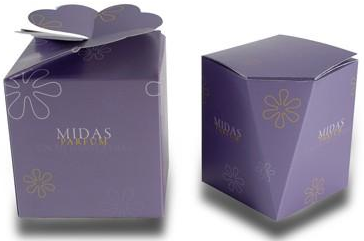
Gift set:

Came across this website.. think it will help with some ideas..
Looking at it a bit more.. not that great.. but has a few good ideas, and may be useful for other briefs.. retail design and a burlesque event I have been asked to promote..
Colour:
Few ideas for colour: Natural looking.. As this is what most women want to look like when wearing makeup..

No comments:
Post a Comment